3 mins agoAverage penis size in UK as urologist explains truth behind 'Ozempic penis'Could the GLP-1 drug be playing a part in the UK's new average penis size?News
an hour agoDoctor says one visible body part can reveal size of man's penisOne for everyone to bear in mindCommunity
2 hours agoWoman’s mukbang video inhaling entire claw of lobster is leaving people seriously unsettledUsers on social media have been shocked by the viral mukbang footageCommunity
2 hours agoWoman who runs legal brothel shares the 'one truth' she has found out from industryFormer PhD student Catherine De Noire manages one of Europe's largest brothels Community
22 hours agoTherapist explains five 'subtle' signs your relationship could be ending soonTime for a hot girl summer?Community
2 days agoAmerican living in the US is dedicated to becoming a fully blown scouserPeople reckon the lad is doing a decent job at morphing into a Liverpudlian Community
3 days agoEvery time Melania Trump has sparked 'body double' conspiracy as recent clip reignites theorySome people are convinced she's not the real MelaniaCommunity
4 days agoMelania and Donald Trump both responded to 'body double' conspiracy as recent clip reignites theoryWill the real First Lady please stand up Community
4 days agoMelania Trump ‘body double’ conspiracy theory sparked after people spot what she did at paradeThe great Melania Trump conspiracy theory lives onCommunity
4 days agoSon of man who shot his brother’s karate instructor live on TV shares important detail 40 years laterGary Plauché waited in disguise before shooting Jeffrey DoucetCommunity
4 days agoWoman dumps her boyfriend after ChatGPT tells her toThe Essex woman spoke to it daily to get over the breakup quicklyCommunity
5 days agoMan who has spent years studying natural disasters reveals how likely an apocalyptic-level event really isThe likelihood of a natural apocalyptic-level event wiping us all out has been revealedCommunity
5 days agoExperts issued warning over certain tattoo colour that could increase risk of deadly diseaseThere can be some long-term health risks to going under the tattoo needle News
5 days agoMan who visited all 197 countries in world says best he has been to has ‘everything you could want’The bloke has seen all sorts on his travelsCommunity
5 days agoImages show inside of ‘Black Mirror style’ building that houses 20,000 peopleThe place is like its own townCommunity
6 days agoMoment of death was recorded for first ever time and reveals what our final thoughts could beThinking about what happens when we die is enough to keep most people awake at nightNews
6 days agoReal reason why Ancient Greek statues all have tiny penises Perhaps they're all growers, not showersCommunity
6 days agoSex expert explains worrying reason people are having less sex following warning to couplesPsychotherapist Esther Perel took to the Diary of a CEO podcast to share her expert opinion on sexCommunity
6 days agoWoman says HR refuses to use her full name in emails because of her unfortunate initialsThe working woman pointed out the bizarre issue she has faced with previous corporate jobsCommunity
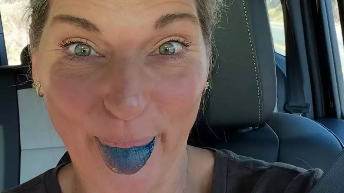
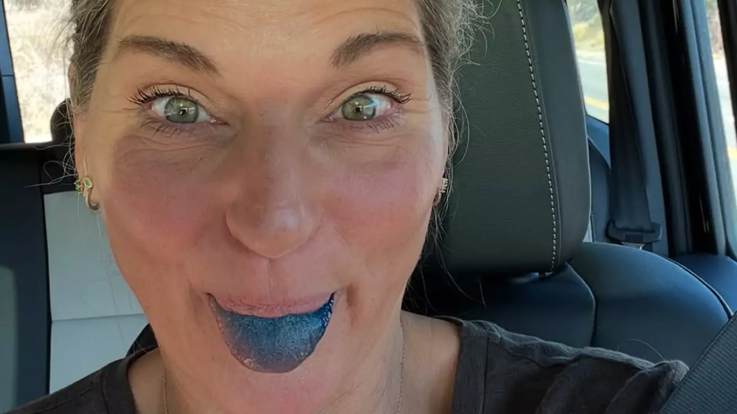
6 days agoHow viral 'limitless pill' affects the brain after doctors issue major warning over substance used by celebritiesThe pill has gone viral after being touted as a health supplement Community
6 days agoBrits left in complete shock at prices after tourist shares receipt for two drinks in Las VegasThe former BGT contestant's bank account took a batteringCommunity
7 days agoDoctors issue major warning over viral 'limitless pill' that is being used by celebrities as 'brain fuel'Used to treat parasites in fish and dye clothes, experts warn against the stuffCommunity
8 days agoShocking report reveals truth about 'gigantic cover-up' fuelled by Area 51 UFO conspiraciesSome people claim to have spotted UFOs flying near Area 51Community
9 days ago'Slippage' is the latest relationship term that suggests your marriage could be 'torn apart'Another one to add to the long list of red flags, ladsCommunity


.jpg)
.jpg)


.png)
.png)