Climate change happens so slowly that it can be difficult to see it happen under our noses - but this brand new video captures the process in action.
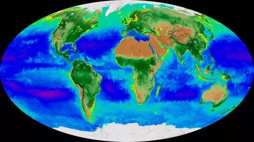
The amazing impact of climate change on Earth over the past two decades has now been shown thanks to a fascinating new map shared by Nasa.
Advert
Using satellites in space, the US space agency has captured 20 years worth of information about Earth's changing seasons and turned it into an animation, a gif. of which you can see below:
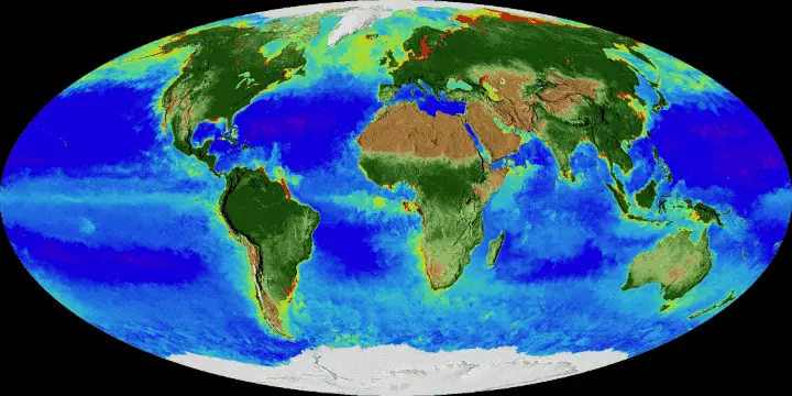
Credit: NASA
Advert
In the video, our planet's ice caps and snow cover can be seen ebbing and flowing as seasons go by. Meanwhile, the changing colours of the ocean show undersea life thriving - or dying.
It's easy to see climate change's impact over time - as the Arctic can be seen getting greener with warmer temperatures spurring more plants to grow.
"It's like watching the Earth breathe. It's really remarkable," said Jeremy Werdell, a Nasa oceanographer who took part in the project.
"It's like all of my senses are being transported into space, and then you can compress time and rewind it, and just continually watch this kind of visualization."
Advert
According to Werdell, the visualisation shows spring coming earlier and autumn lasting longer in the Northern Hemisphere. He also pointed out the Arctic - and the Antarctic - ice caps receding over time. Scary stuff.
Also visible in the video is a "hugely productive bloom of biology" that emerged in the Pacific Ocean between 1997 and 1998 - an algae bloom shown by a line of bright green along the Equator.
This bloom happened when a water-warming El Nino event merged with a water-cooling La Nina - both phases of a well-known variation in wind and sea temperatures in the area.
Interestingly, one of North America's five Great Lakes, Lake Erie, is also subject to more algae blooms which can be seen in red and yellow.
Nasa first began keeping a continuous view of life on Earth in September 1997 using several satellites called the Sea-Viewing Wide Field-of-view Sensor (SeaWiFS).
Advert
The two and a half minute data visualisation released by Nasa covers a period starting from September that year up to this past September 2017.
Werdell said that the data could prove extremely useful for lawmakers as well as commercial fishermen and other professions.
The visualisation apparently took three months to complete, according to programmer Alex Kekesi, at Nasa's Goddard Space Flight Center in Maryland.
As Nasa launches new remote-sensing satellites and improves its computer systems, the visualisation is set to keep changing over time.
Advert
Let's hope that those in charge pay enough attention to make sure that Earth doesn't change too much with it.
Source: The Independent
Featured Image Credit: PATopics: Science, climate change, Nasa, Technology