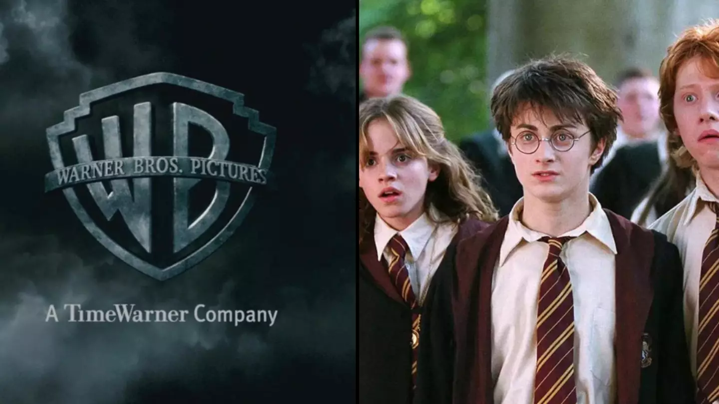
We've all repeatedly binge watched the eight incredible movies which make up the Harry Potter franchise, but some hidden features might have managed to go over your head.
It's easy to get caught up in the magic of the Wizarding World, so don't worry if you're currently scratching your head wondering what I'm talking about.
Being engrossed by Harry Potter is hardly a crime, however, it may cause you to overlook the small stuff which makes the series so special.
If there is one thing about Warner Bros., it's that it is well aware the devil is in the details.
Advert
Movie buffs have managed to spot a running theme which the producers slipped into the opening scenes of all the Harry Potter films.
It's a blink and you miss it kind of moment, but once you spot it, you'll be unable to believe it went unnoticed for so long.
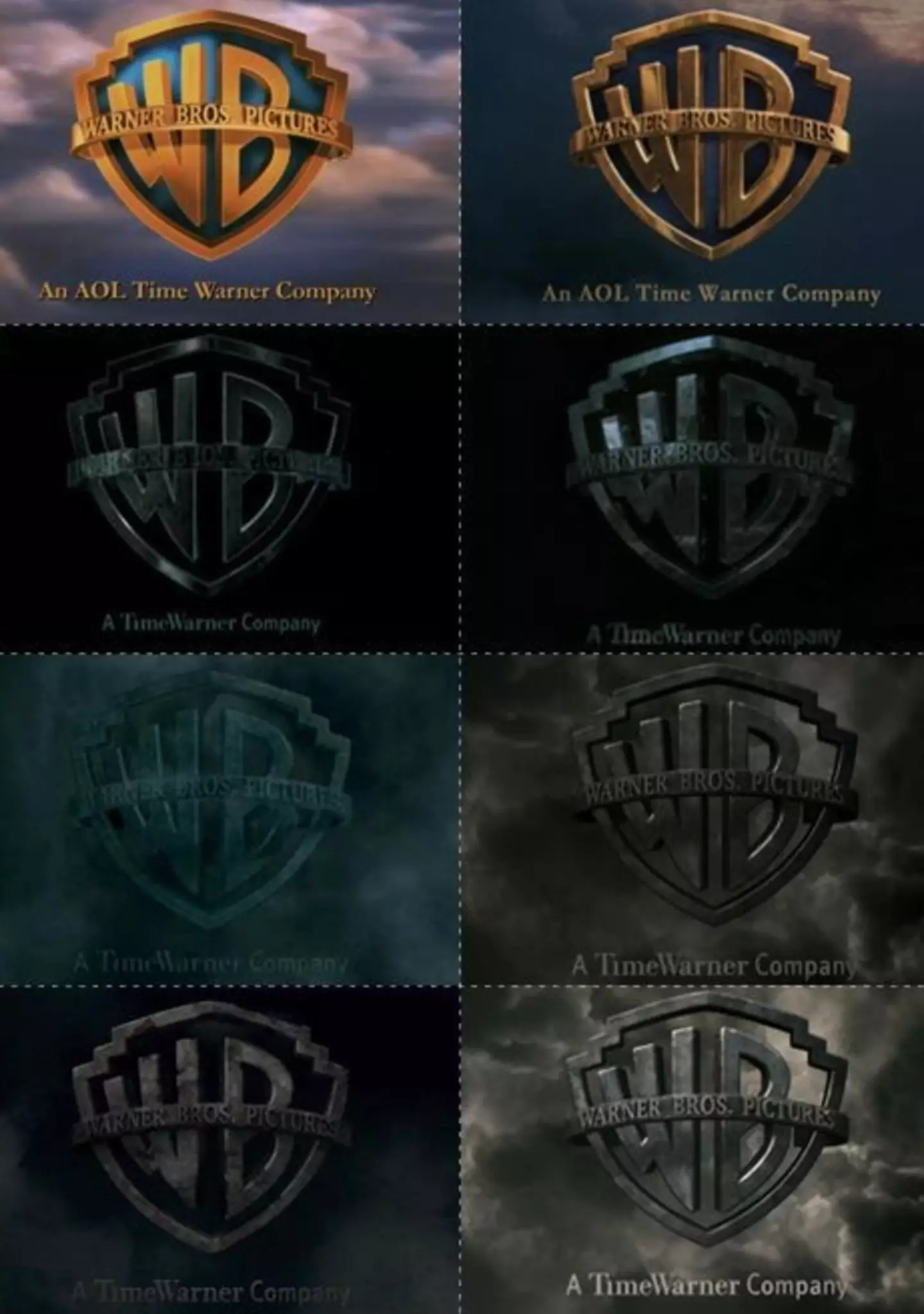
Eagle-eyed viewers realised that as each film progresses, the Warner Bros. symbol at the start of each one becomes darker.
Like most things in the spellbinding flicks, there is an intention and a story behind it.
Advert
You may recall that our introduction to Hogwarts was fairly tame in comparison to the final Harry Potter instalment.
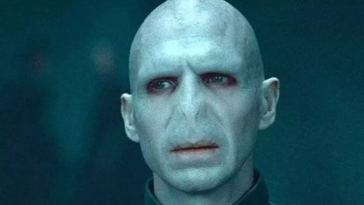
As Voldemort grew stronger each time he faced off with the boy who lived, played by Daniel Radcliffe, the Wizarding World gradually got worse.
To signify the decline of goodness and the rise of terror, fans have speculated this is why the opening scenes grew increasingly darker as the films went on.
Advert
The Warner Bros. logo began with vibrant colours and a cloudy backdrop, but by the final film, it's an eerie shade of grey with a serious storm brewing in the background.
The iconic WB emblem itself became more and more tarnished, leaving it rusty and degraded by the time we get to Harry Potter and the Deathly Hallows - Part 2.
Pretty cool, right?
Advert
Social media users seemed to think so, as many admitted they had never paid attention to the darkening visuals and mood.
One said: "The way their logo went darker and darker just like the movies."
Another commented: "Love the Warner Bros gets dark at number three just like the movies."
A third added: "It's a small thing but it really sets the mood for the film and I love it so much."
Advert
Someone else joked: "It's like my life. First years are the best, but the older I get, the darker life gets."
While a final user chimed in: "There needs to be more info about this. Was this planned? It starts getting dark literally on the second WB sign."
LADbible has contacted Warner Bros. for comment.
Featured Image Credit: Warner Bros.Topics: Harry Potter, Daniel Radcliffe, Warner Bros, TV and Film