Ever wondered why so many fast food places have logos with plenty of red and yellow in them?
Well, that's what you clicked for and that's what we're going to tell you today as we delve into some psychology.
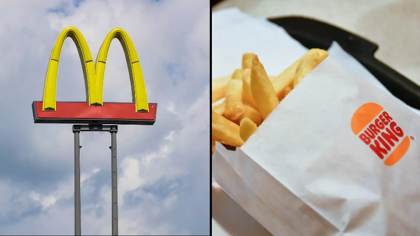
You surely know, dear reader, what the iconic golden arches of McDonald's look like perched atop a red platform, while the Burger King logo is a similar combination of colours shaped like their namesake food.
Advert
Pizza Hut goes with red and yellow, Subway has yellow, KFC goes big on the colour red, even the places which have other main colours almost certainly contain flecks of red and yellow.
Red is really the main colour they want to go for here but there's a very good reason why the fast food chains pick their colour palette so carefully.
They've built up such recognisable brands that it would be weird to change logos now, but there's much more at play here than just a recognisable image, there's a big psychological element to it too.
Here's the science-y bit, according to psychologists different colours can make us feel different things and the colour yellow is apparently really good at making us feel comfortable.
Advert
The colour yellow makes us feel contented and happy, it's a nice warm hue but not in your face about what it's doing so when you see it it'll make you feel good.
That's to the benefit of fast food chains which want you to associate them with good feelings but the kicker is the colour red which pops up in so many fast food logos.
The same psychology which says yellow makes us feel good also says that the colour red makes us hungry.
According to research from the University of New Hampshire, having lots of red on the logo can prompt feelings of 'stimulation, appetite, hunger, and attracts attention'.
Red makes you look at something and it makes you hungry, by combining the two you're now fancying something to eat while you're staring right at a fast food restaurant.
Advert
It's no surprise what the outcome is going to be with that, and the yellow colour will make you feel good about it as well.
All in all it's a chromatic psychological cocktail designed to grab your attention and put you in the mood for fast food.
On top of that the red and yellow colours on the logos look quite like a lot of the things they serve on the menu.
It's a bit more obvious in Burger King's case but who hasn't looked at the McDonald's arches and thought they looked like a couple of fries.
Featured Image Credit: Paul Weaver/SOPA Images/LightRocket via Getty Images/Stefano Guidi/Getty ImagesTopics: Food And Drink, McDonalds, Burger King, Science