Real reason behind Coca-Cola’s iconic red packaging as iconic truck tours UK
Believe it or not, Coca Cola's iconic red packing actually has nothing to do with the festive period.
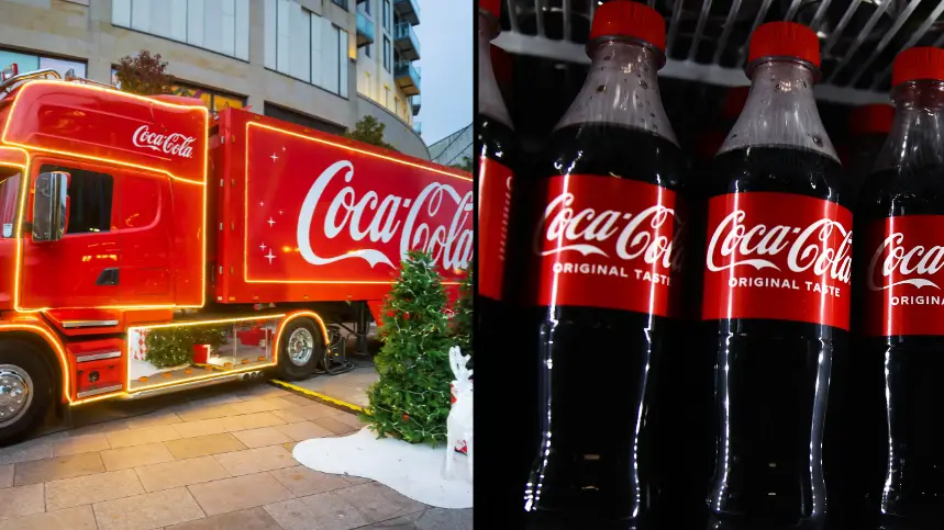
The drink company's ‘Holidays Are Coming’ ad has become an annual tradition over the decades, and Coke fans can't wait to see the truck in real life this year.
Each year it tours the UK and Ireland to hand out cans of festive joy - with its tour kicking off last week in Dublin on 30 November.
Advert
And this year's Christmas ad - titled 'The World Needs More Santas' - sees the Santas helping out their neighbours, sharing the last Coca-Cola at a vending machine, all while offering a small act of kindness to a stranger in need.
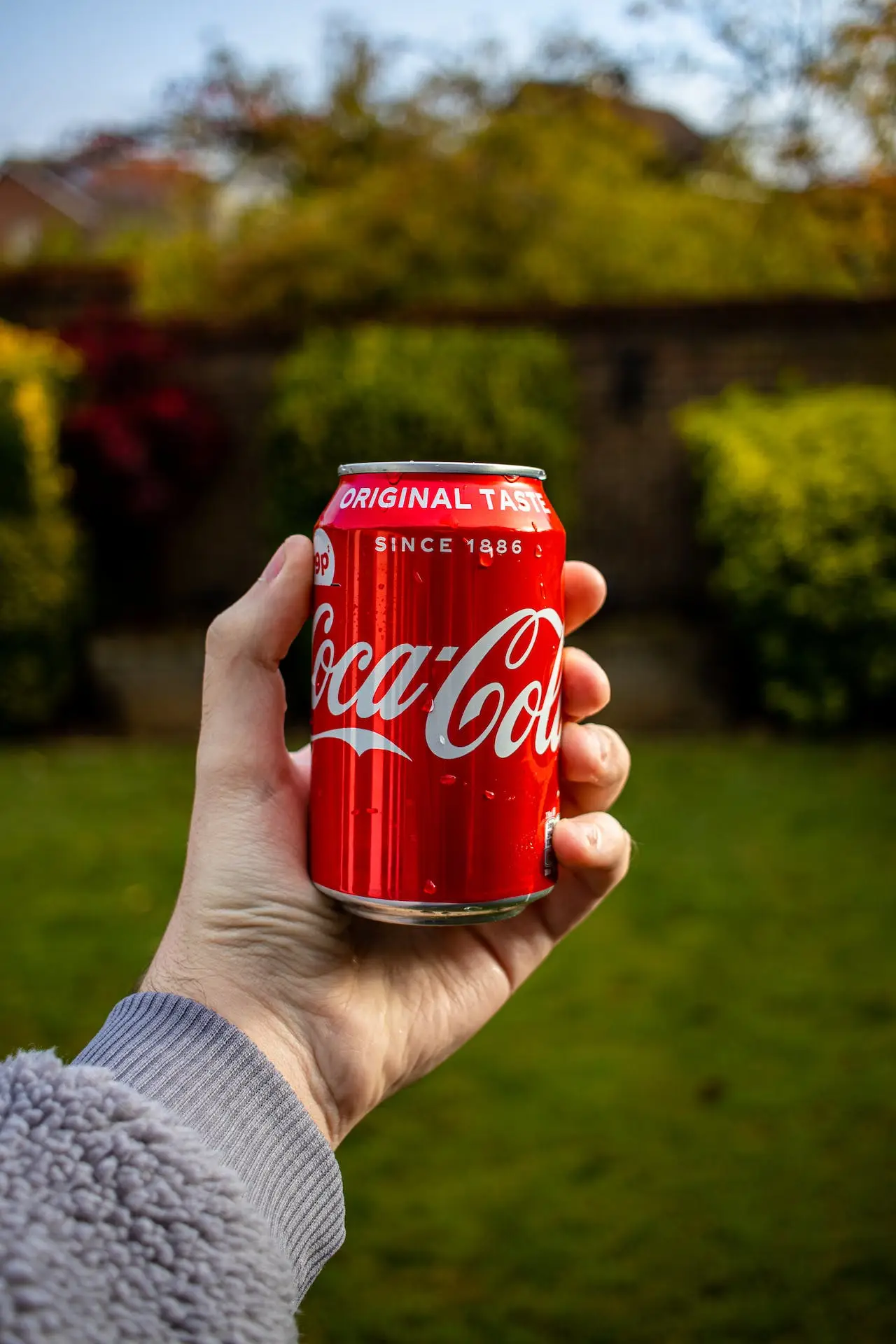
And as we will all be aware, the common theme throughout Coke's Christmas ad is the colour red.
But it turns out the colour of the original Coca-Cola branding has never actually been a nod to its famous Christmas campaign.
There appears to be two possible explanations for this.

According to Coca-Cola, inventor Dr. John Pemberton’s bookkeeper and partner Frank Robinson liked the contrast of red and white.
To make the drink stand out from the completion, Robinson decided to write 'Coca‑Cola Delicious and Refreshing' with red lettering over a white background on the company’s earliest signage.
The iconic red disc helped solidify the connection between the brand and the colour.
“You see a red disc icon on a storefront, and you know that you’ll be able to get delicious, ice-cold Coca‑Cola there,” Coca‑Cola Archivist Ted Ryan explains.
“It became a promise in a way.”
However, another explanation for the colour red was provided to Prima.co.uk and has since been confirmed by Coca-Cola.
Coca-Cola Company ultimately made the decision to paint its barrels red to make it very clear to customs and tax officials that their barrels did not contain booze, and therefore should not be taxed.
This took place way back in the 1890s when alcohol was taxed and, of course, the fizz was first sold.
So, there you have it.
Fast-forward to 2023, the company has promised to change with the times and has provided a very good reason for making the lid on their newer bottles extremely difficult to take off.
Back in May, brands including Coca-Cola Original Taste, Coca-Cola Zero Sugar, Diet Coke, Fanta, Sprite, Dr Pepper and Lilt, started to get the cap-on treatment.
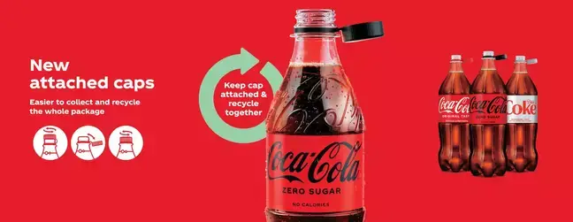
Coca‑Cola Great Britain (CCGB) said it is trying to make 'it easier to recycle the entire package and ensure no cap gets left behind'.
A spokesperson for Coca-Cola told LADbible: “Coca-Cola’s new attached caps are designed to prevent litter, and make collection and recycling easier by keeping all parts of the bottle together.
“We understand that it’s a bit of a change, however extensive research went into the new design to ensure consumers continue to have a positive experience when enjoying our drinks.
"When opening and closing the bottle, we advise consumers to not remove the cap from the bottle neck, or twist or bend the tab in a way that could compromise or damage the closure.”
Topics: Food And Drink