Lyle’s Golden Syrup had logo for 140 years with dark hidden meaning
You may still like to drizzle some Lyle's Golden Syrup on your morning pancakes, or even mix it in with your porridge, but did you know its logo was darker than it seemed?
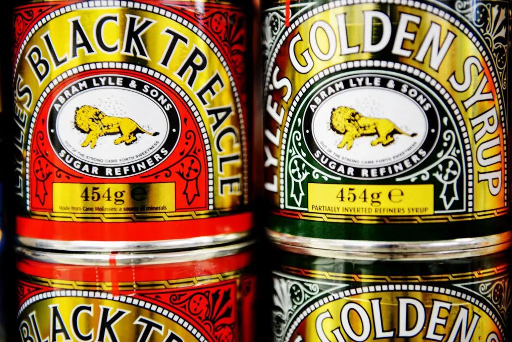
A lot of people are familiar with the condiment's logo, which has been displayed in supermarkets around the UK for 140 years.
The thick syrup is a welcome sweet treat to this day, but on thing has changed over the years - the logo.
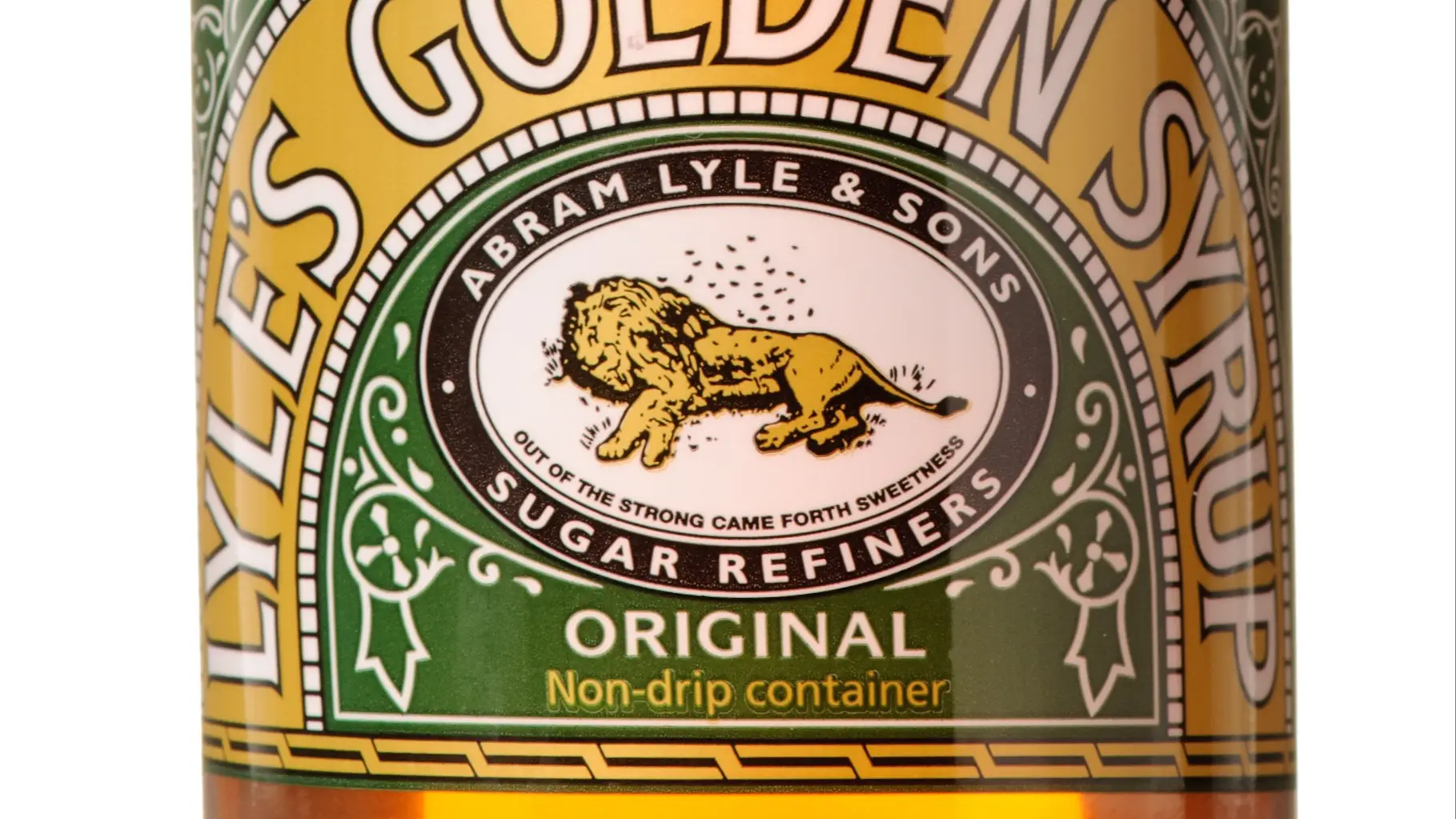
The old illustration of a lion was long the symbol of the product, and it can still be found on some existing stock.
Advert
Under the lion, it read: "Out of the strong came forth sweetness," below the drawing of the lion lying on its side.
It appeared on packaging for the first time in 1883, and even held the Guinness World Record for the world’s oldest unchanged brand packaging.
According to the website, it explained that due to the company's 'religious beliefs', the logo depicts Samson's 'lion and bees' from the Bible, which has been registered as Lyle's trademark.
It goes on: “‘Out of the strong came forth sweetness’ as the quote goes; where bees produce honey inside the lion's carcass, rich syrup pours from the well-loved tin…”
It took a while, but Brits noticed the change to its iconic design on X back in 2022, with many not being aware that the lion on the iconic green and gold packaging was actually dead.
Obviously, this isn't the most positive thing to see while you're noshing on waffles.
Some wrongly assumed that the bees were flies, but many noted that they 'can't unsee it', with others even claiming the syrup was 'ruined' forever.
Following a rebrand though, Lyle's now displays a lion's head on all products that aren't the classic tin, which is still available to purchase.
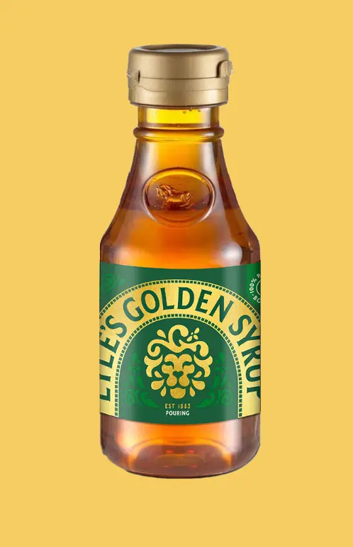
Speaking in February 2024, brand director James Whiteley said of the change: “We’re excited to unveil a fresh redesign for the Lyle’s Golden Syrup brand.
“While we’ll continue to honour our original branding with the heritage tin, consumers need to see brands moving with the times and meeting their current needs.”
Describing the new design as 'fresh' and 'contemporary', he said that it would now 'appeal to the everyday British household'.
“We’re confident that the fresh new design will make it easier for consumers to discover Lyle’s as an affordable, everyday treat, while re-establishing the brand as the go-to syrup brand for the modern UK family, featuring the same delicious taste that makes you feel Absolutely Golden,” he concluded.
Topics: History, Food And Drink, UK News