Met Office Reporter Warns Brits Over Doctored Weather Maps
A Met Office reporter has taken to Twitter to warn people of sharing doctored weather maps after an image went viral that supposedly compared how the weather was reported historically to now.
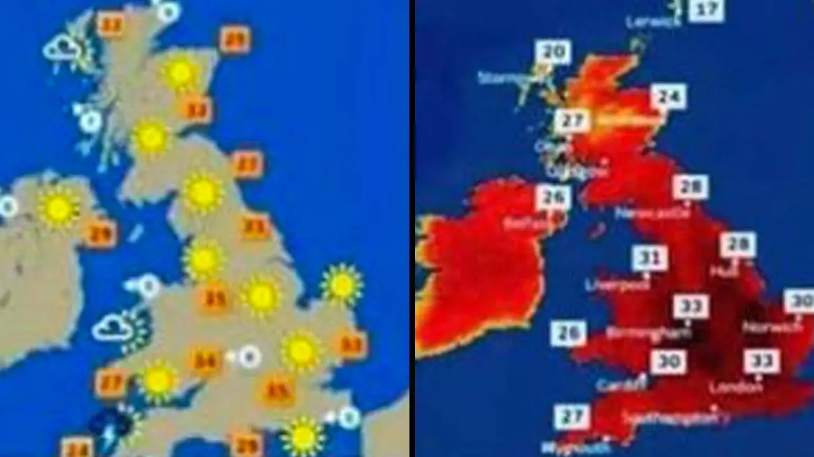
You might have already seen it, but in the run up to the current heatwave sweeping the UK, an image was circulated showing what's described as an 'old school weather forecast' on the left and a 'new style weather forecast' on the right. Take a look below:
I’ve seen this ridiculous comparison a lot on social media during the last few days
— Aidan McGivern (@aidanweather) July 17, 2022
I created the Met Office temperature colour scale with help from a colleague
That’s why I know:
- The image on the right is doctored
- Met Office graphics are not designed to cause fear
🧵 1/8 pic.twitter.com/XBulpKiLWs
Each photo shows the UK with a broadly similar high temperature forecast on it, but the older one on the left has a lukewarm colour design on it in comparison to the one on the right that's coloured in deep shades of crimson, described as 'designed to look like fear and destruction'.
The daft point being made is that the Met Office are trying to further some kind of climate change propoganda by making out these temperatures are a bigger threat to life than they actually are.
Advert
That is, of course, complete nonsense given the effects of climate change are very real and more worryingly accelerating rapidly with a host of extreme weather events happening around the world in the last couple of months alone.
According to Met Office reporter Aidan McGivern, it turns out the two images are also nonsense.
McGivern knows this because he created the temperature colour scale for The Met Office and so says the image of 'fear' on the right is doctored.
How do I know it’s doctored?
— Aidan McGivern (@aidanweather) July 17, 2022
We had a graphics redesign early this year
We changed the map view, temperature symbols & colour scale etc
This image uses the old map view, the old symbols but not the old temperature colours
Here’s how the old scale looked at 30-34 C
2/8 pic.twitter.com/VfdBfSiirR
McGivern admitted that there had been a colour re-design earlier this year, but posted an image of a pre-new design hot weather forecast that showed a colour palette far less timid than the supposed 'old' image posted on social media.
Furthermore, the reason for the new design was nothing to do with trying to scare people about the weather - the numbers are frightening enough on their own - but in fact was to help those who are colour blind see it better.
"Unfortunately, the old scale (which used a mixture of blues, greens, oranges, reds) wasn’t accessible for people like me who are colourblind," he explained.
"So, we changed the temperature colours to make the maps easier for people who are colourblind like me. That’s it, no conspiracy".
The reporter then displayed a forecast from last month where there were expected highs of 34 degrees celsius and even then there were no reds as dark as on the viral image.
The new temperature colour scale does go darker when it gets hotter (especially >38.7 C, the UK record)
— Aidan McGivern (@aidanweather) July 17, 2022
It also goes darker when it gets colder
That works better for people who are colour blind – variations in light / dark rather than hue
Old (left) vs new (right):
6/8 pic.twitter.com/hi01tAwQYI
There are some darker reds on the forecast for this week - but that's because we're about to witness a record high in the UK.
"The new temperature colour scale does go darker when it gets hotter (especially >38.7 C, the UK record)" he wrote.
"It also goes darker when it gets colder. That works better for people who are colour blind – variations in light / dark rather than hue
"When we designed the new colours, in Autumn 2021, only parts of the Middle East and North Africa were >39 C.
"I thought these temperatures would turn up occasionally in Spain in the summer. I never expected them to appear on UK maps".
Conspiracy debunked.
Topics: Weather, UK News, Environment, Conspiracy Theory
 Simon Catling