Lyle's Golden Syrup ditches logo with dark hidden meaning after 150 years
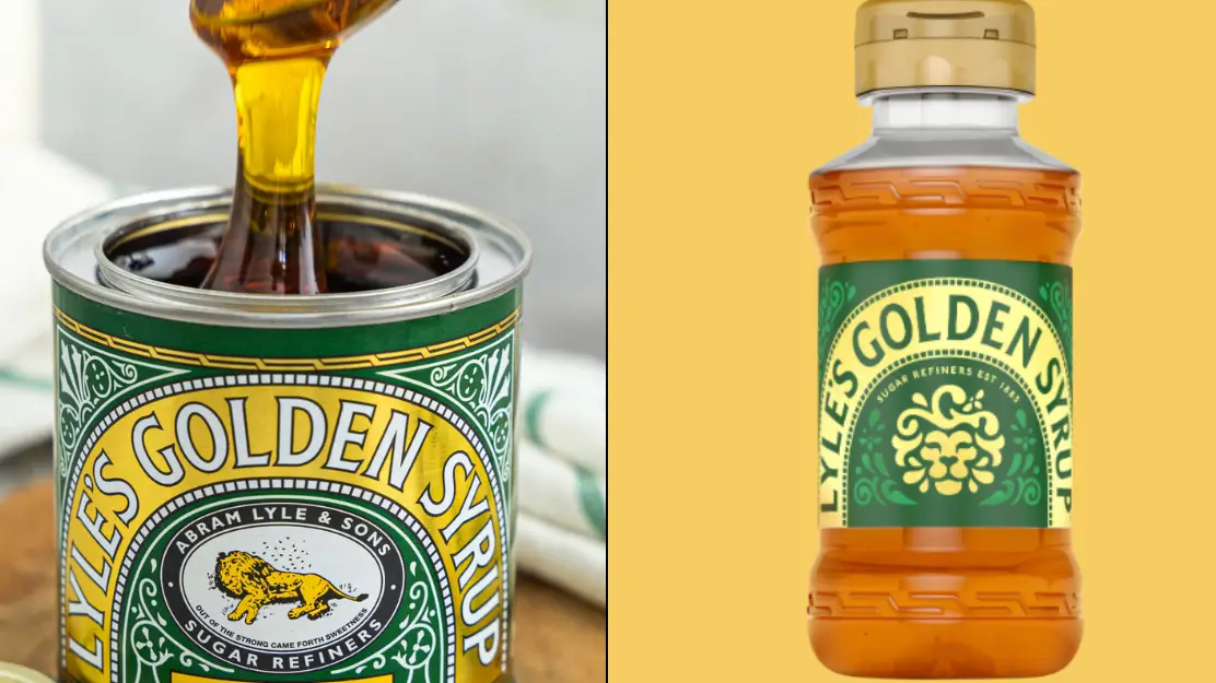
Lyle’s Golden Syrup has gone for a sleek new rebrand on some of its products - removing the illustration of a dead lion to something more cheerful.
For those who are partial to a bit of the sweet syrup, you may have spotted the somewhat unusual image that adorns the front of its products - it shows the carcass of a lion, lying on its side with a swarm of bees flying near its head. Underneath the drawing are the words: “Out of the strong came forth sweetness.”
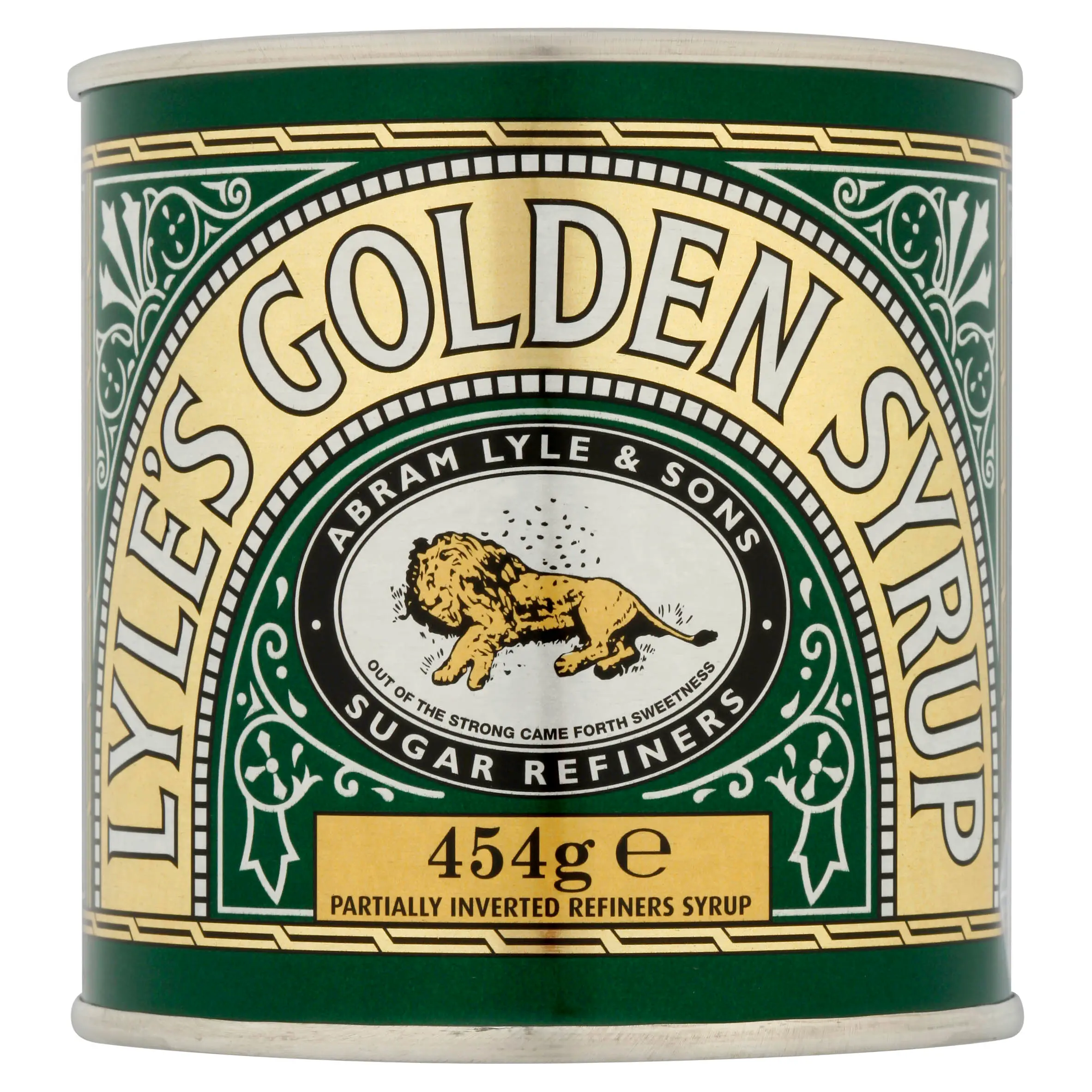
The slightly morbid drawing has a long history behind it, having first appeared on tins all the way back in 1883 - in fact it holds the Guinness World Record for the world’s oldest unchanged brand packaging.
Advert
On its website, the company explains: "Lyle had strong religious beliefs, which is why the tin's famous logo depicts strongman Samson's 'lion and bees' from the Bible's Old Testament, registered as Lyle's trademark.
“‘Out of the strong came forth sweetness’ as the quote goes; where bees produce honey inside the lion's carcass, rich syrup pours from the well-loved tin…”
Sounds… erm lovely.
In fact, Brits were left shocked after first noticing the design back in 2022 when one shocked X user wrote: “Tell me I’m not the only one who didn’t realise the lion on Lyle’s Golden Syrup packaging is depicted dead?!"
And others were quick to jump in to admit they also hadn’t spotted it before, with one responding: "Oh ew I assume they are flies around it! How odd?!"
"Hope never realised and now can’t unsee it," said another, while a third added: "Genuinely ruined it for me!"
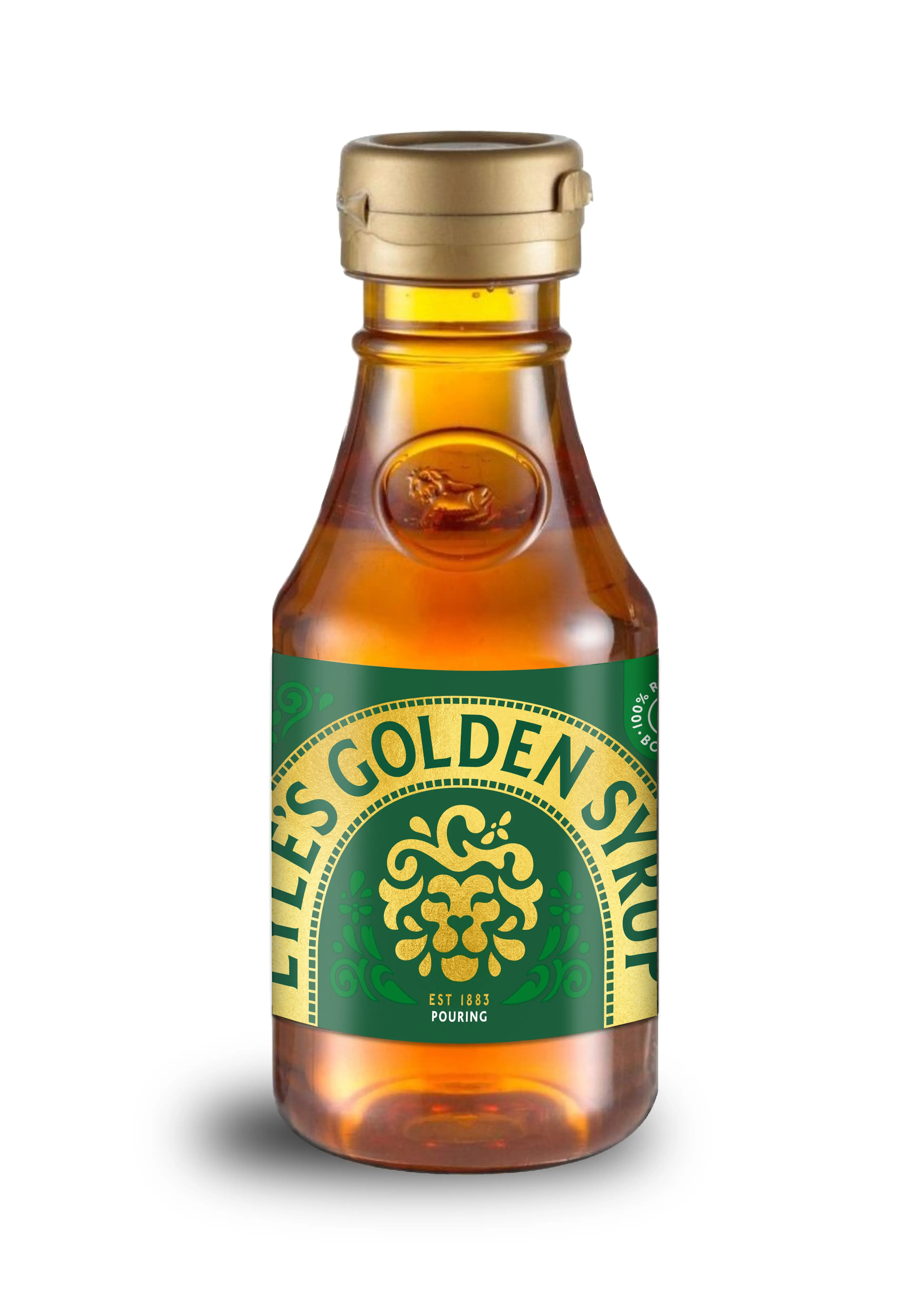
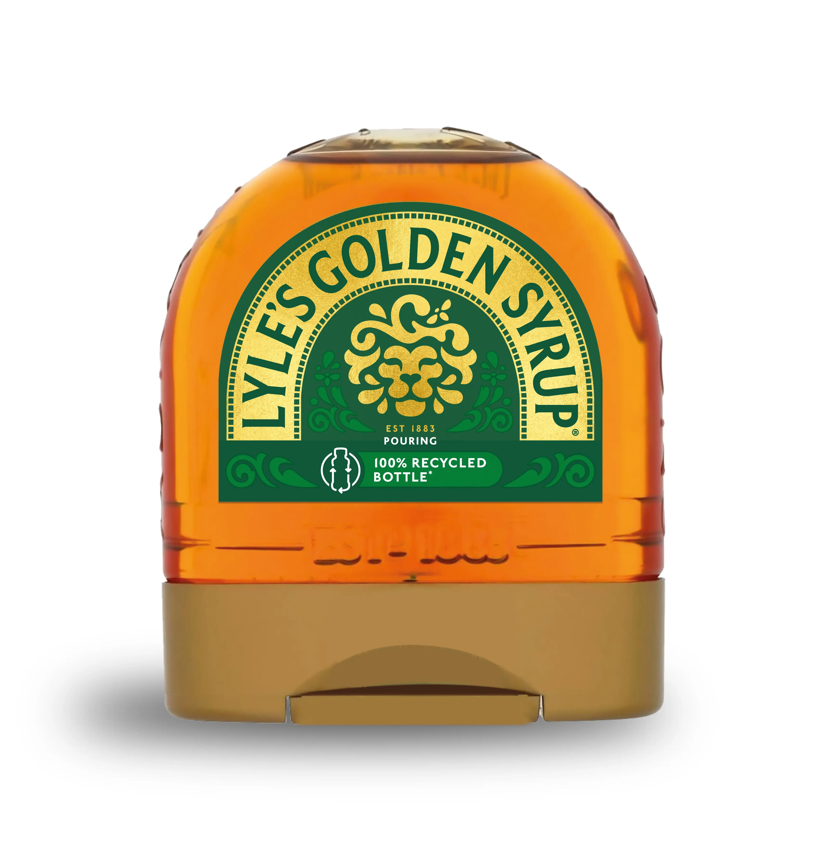
Well now, Lyle’s has introduced a rebrand that will take place across the full product range, excluding the classic tin, which will retain the original illustration.
James Whiteley, brand director for Lyle’s Golden Syrup, said: “We’re excited to unveil a fresh redesign for the Lyle’s Golden Syrup brand.
“While we’ll continue to honour our original branding with the heritage tin, consumers need to see brands moving with the times and meeting their current needs.
“Our fresh, contemporary design brings Lyle’s into the modern day, appealing to the everyday British household while still feeling nostalgic and authentically Lyle’s.
“We’re confident that the fresh new design will make it easier for consumers to discover Lyle’s as an affordable, everyday treat, while re-establishing the brand as the go-to syrup brand for the modern UK family, featuring the same delicious taste that makes you feel Absolutely Golden.”
Topics: Food And Drink, History, UK News