There’s no denying it, it’s getting really f**king hot in the UK. The scramble to buy a fan for your room begins and the sweating on the commute to work is all too visible.
And as those typical ‘wow it’s hot isn’t it’ British conversations begin, the debates on social media about the weather start to kick off.
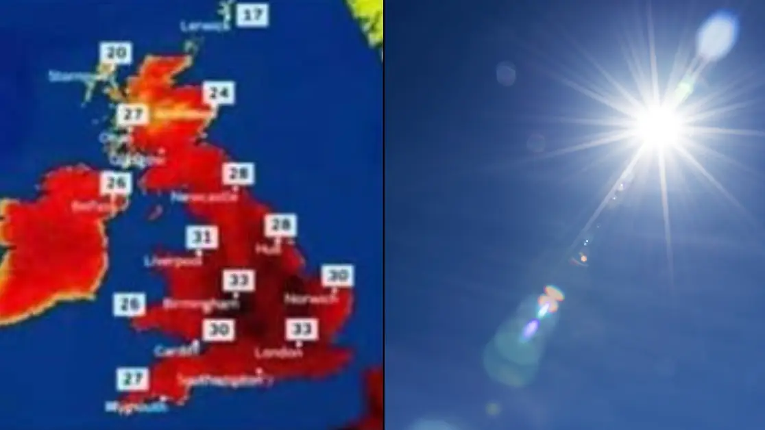
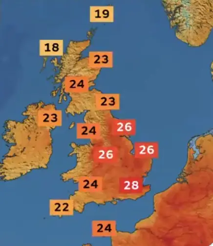
The UK has been issued a warning as a blistering heatwave begins this week with highs of up to 30C set to hit the country with heatstroke a possibility for many.
So, as we all gear up to be microwaved at home, it’s worth taking note of this warning from a Met Office reporter over doctored weather maps.
Advert

Back in 2022, when the UK experienced some serious heatwaves, Aidan McGivern took to X to dispel some theories and debates circulating online.
He shared a screenshot someone had posted of two weather maps side by side which read: “LEFT – Old school weather forecast. Happy and sunshiny.”
Then, it showed the ‘new style weather forecast’ which was a deep red colour, rather than the light green with little sun icons, claiming it was ‘designed to look like fear and destruction’. It added: “IT’S CALLED SUMMER.”
But McGivern called the comparison ‘ridiculous’ and said the ‘image on the right is doctored’.
“Met Office graphics are not designed to cause fear,” the reporter assured.
He explained how even before a ‘graphics redesign’ the Met Office used ‘oranges and reds on the maps’ with none of them ‘resembling the image in the first post’.
McGivern continued: “Unfortunately, the old scale (which used a mixture of blues, greens, oranges, reds) wasn’t accessible for people like me who are colourblind.
“So, we changed the temperature colours to make the maps easier for people who are colourblind like me. That’s it, no conspiracy.”
The reporter explained that the colour scale goes darker when it gets hotter, which is ‘better for people who are colour blind’.

But he did add that when they designed the new colours back in 2021 he ‘never expected them to appear on UK maps’ – showing just how flipping hot it’s getting over here.
And for those kicking off about the lack of the icons, McGivern also said: “By the way, we do still sometimes post happy sunshiny maps on social media. But, most of the time, we use data-driven maps rather than weather symbols. We’ve been doing this for years.”
So there you go lads, get your weather info from official sources – not necessarily from people kicking off with conspiracies on social media.
Topics: Social Media, UK News, Weather