In life a lot of things change.
Bank notes get re-designs, as do coins, classic packaging get revamps and websites change all the time.
In a world where the element of change is pretty much the only constant you can come to expect, I heed the words of Will Smith: 'if it ain't broke, then don't try to fix it'.
Advert
Google is one of those things that didn't necessarily need any changes, but yet, here we are.
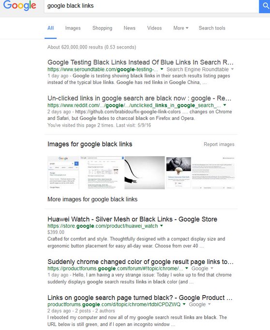
The world's most popular search tool is currently testing a new feature that see's their links appear black, rather than the traditional blue.
It doesn't sound like a massive difference, but when you're so used to something, it makes a big difference.
People aren't too happy with the change, and you can understand why - it looks rather odd.
If you're yet to come across the new format, it's because it's still in its 'A/B testing' phase, meaning it'll only appear for certain people - technological guinea pigs.
Advert
It's not the first time Google has rolled out A/B testing with links. They once did a test - nicknamed '50 Shades of Blue' - which tested 41 different shades of blue for hyperlinks.
The test was done to see what colours users are more likely to click on, finding a shade closer to purple worked best. It earned Google an extra £138million.
A spokeswoman for Google said: "We're always running many small-scale experiments with the design of the results page. We're not quite sure that black is the new blue."
What does everybody think?
Featured Image Credit:Topics: Google