There is a lot of information floating around the internet about the Australian bushfire crisis - but some graphics are misleading, according to Brisbane photographer Anthony Hearsey.
Maps have been shared online that claim to depict how much of the country has been burned by bushfires, theoretically to put the severity of the crisis into perspective.
However, it appears that the way these images are being shared is often misleading or simply not accurate.
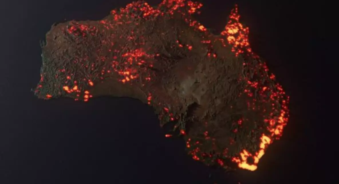
This map above - produced by Hearsey - is meant to be an artistic interpretation of the bushfires, based on NASA's Fire Information for Resource Management Systems.
Advert
However, after it was retweeted and shared across the internet, many people thought that this was an actual satellite shot of Australia from space.
Hearsey told Buzzfeed that his map has been taken out of context by a few people.
He said: "The image is an artistic rendition of data. It's not meant to show what Australia looks like currently.
"I never expected the image to reach anyone past my own friends. I have a fairly small social media following, so it was just another image really."
Advert
The creator admitted that the scale of the fires was 'a little exaggerated due to the render's glow'.
Another map that has been shared widely shows much of Australia's east coast on fire.
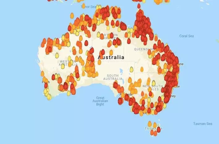
While this is true to some degree, the number of fires - and their severity - has been exaggerated because of the algorithm that puts it together.
Advert
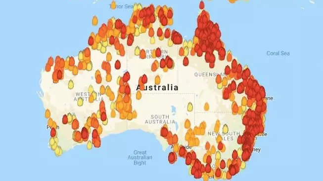
The above map has been put together by the Australian government website MyFireWatch.
According to the website, the data it collects includes fires and 'any heat source that is hotter than its surroundings'. It goes on to explain that this can include 'gas flares, refinery furnaces or highly reflective large industrial roofs'.
The way it presents the data is also mildly misleading.
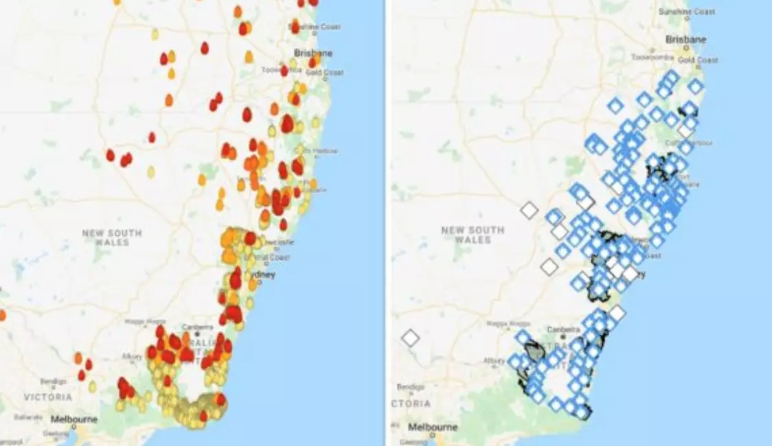
If you've seen a map from the Ne South Wales (NSW) Rural Fire Service (RFS) or Victoria's Country Fire Authority, the dots indicating a fire will illustrate its level of severity with a colour. In NSW, the colour goes from blue (Advice), to yellow (Watch and Act), to the highest, which is red (Emergency).
Advert
The MyFireWatch map shows plenty of red coloured fires, giving the impression that there are many dangerous blazes raging. But a red fire symbol simply means a heat source was detected in the last 12 hours.
When you compare it to a NSW RFS map, a lot of the heat sources match up, but their severity is much different. While the MyFireWatch website will have a legend key, that often isn't included when people share this map.
It's also been used to put over various countries to illustrate how much land is being burned, which is also misleading.
Then there's this map below:
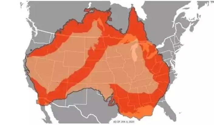
It's unclear where this map has come from but it's attempting to show that nearly the entire coastline of Australia has been caught up in the flames, as well as a sash through the middle of the country.
Advert
It was shared by news outlets like ABC in America and, again, has been placed over a map of the US to demonstrate that a lot of the country is on fire.
Please ensure you're not one of those people who are retweeting or sending these pictures to your mates.
It's a hell of a lot easier going to the source of the various fire authorities around Australia to get the current state of affairs.
Correct information during a crisis like this is incredibly important.
Featured Image Credit: MyFireWatchTopics: Viral, News, Bushfires, Australia