People are shocked after realising the secret sexual meaning behind the McDonald's logo
If you've ever looked to the horizon and spotted a pair of Golden Arches glinting at you in the distance, then you'll know the sense of relief that comes with eating a familiar warm meal.
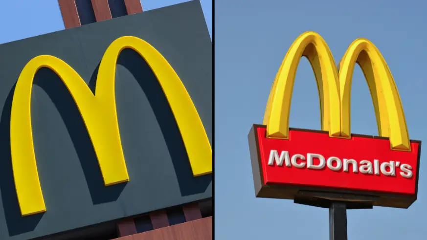
And, as it happens, those iconic golden curves aren't just because McDonald's starts with an 'M'.
The Golden Arches actually have a slightly dirtier reason for being, with them said to be fashioned after a pair of saggy breasticles.
The claim is backed up by Eric Schlosser, who penned Fast Food Nation: The Dark Side of the All-American Meal.
Advert
He claimed the two original owners of what is now the world's best known fast food chain wanted to axe the logo altogether in the 1960s.
However, design consultant Louis Cheskin convinced the Macca's big chiefs to keep them.
He believed there was power in those twin arches.
After all, they weren't just alphabetical...they were anatomical, too.
Cheskin argued the symbols were Freudian in nature.
Logically, if the symbolism behind the arches was intended to represent a mother’s nurturing breasts, then subconsciously hungry customers should associate McDonald's with home and comfort.
You know what they say: sex sells.
The US psychologist added that the 'maternal' element to the design encouraged people to dine out at their new, whiz-bang fast-food restaurant instead of eating at home.
After all, the phrase 'give mum the night off' was coined as an early promotional tagline used by the fast food giant in the 1960s,
It's all starting to make sense now.
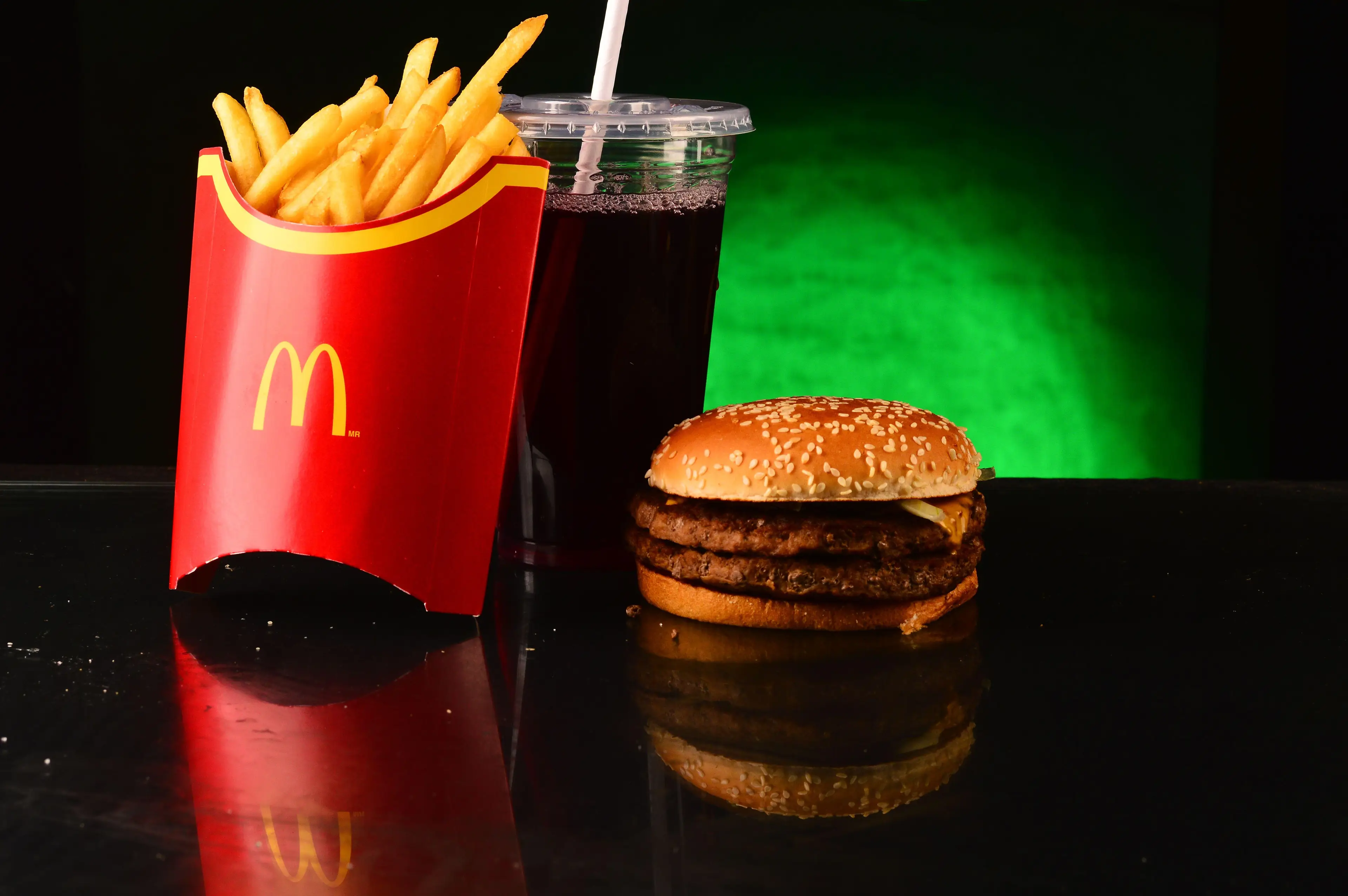
Plus, the future fast-food giant chose their colours very carefully.
Just take a squiz at the yellow and red of the Macca's sign.
Or at the slogan for Burger King or Hungry Jack's.
Yellow is typically associated with feelings of happiness. or warmth. Of both comfort and reliability and health and wellbeing.
Well, the last two don't really link up with fast food.
But people tend to stress less about junk food when there is a 'don't ask and don't tell policy' when it comes to calorie counting.
On top of all that, it's an eye-catching shade.
Which is exactly why hazard signs, taxis and their vacancy lights, and double yellow lines are all the same colour.
Red is a colour of hunger and impulsiveness, which are two big ticks for advertisers and pro-junk food campaigns.
Oh, and did you notice they look like ketchup and mustard?
Well, if you've read this far and still think that is a coincidence, then you're clearly someone who picks the pickle off of their cheeseburger before eating.
Anyway, who ordered a serving of fries with a side of boob?
Topics: McDonalds, Food And Drink