People stunned after discovering Netflix's original logo
Happy Birthday, Netflix!
The streaming giant turned 26 this week, having been originally founded on August 29 back in 1997.
A lot has changed in the last two decades, including the brand's original logo, which has shocked some binge-watchers.
Advert
If you weren’t around for the early days of the streaming service, you might not remember that it originally was a DVD rental service - a bit like Blockbuster, sans the shop, if you remember that either?
The brainchild of Reed Hastings and Marc Randolph, the site allowed users to order their fave films online with the DVDs then being mailed out.
In fact, the rental service will stop this year despite the platform becoming a streaming service over the last two decades.
As it grew into a globally recognised brand with original content, Netflix also updated its logo over the years.
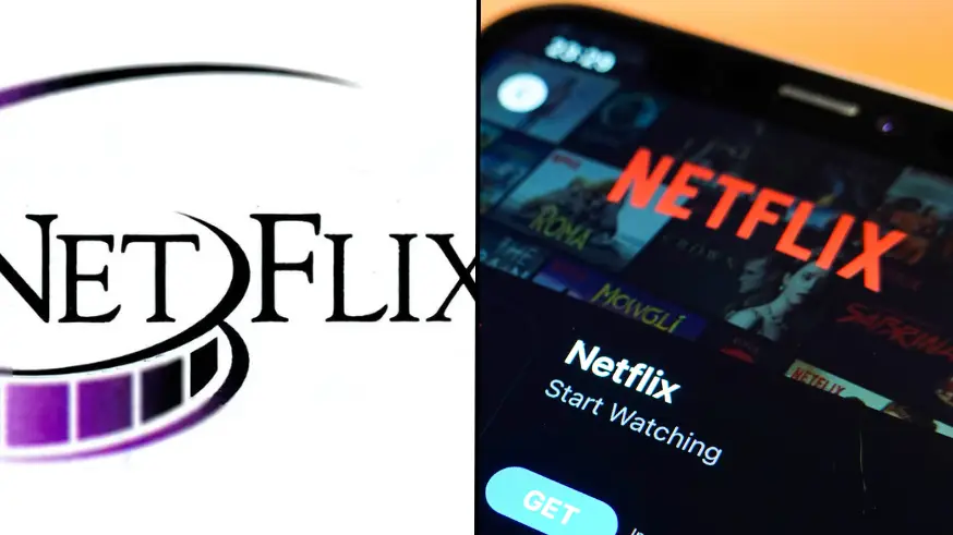
However, the first branding was a little, um, low-tech, shall we say.
Given it was the nineties, you’ll not be surprised that it looks like it was designed with Word Art with the purple film reel separating the ‘net’ and the ‘flix’.
The design didn’t last long and was replaced in 2002, but it still left some viewers pretty unimpressed.

Failing to reel in their displeasure at the film reel logo, one Twitter user wrote: “Omg it looks like a site that would give u a virus.”
Another added that the logo looked like it belonged on an adult site, comment: “It’s giving Microsoft word art porno company graphic.”
“Why does it look like it requires a prescription,” a third said, while a fourth tweeted: “Wow this looks so bad”
Though they have been mocking the logo, it actually has an important detail that isn’t included in Netflix’s modern logos – and not it’s not the film reel!
Eagle-eyed film fans will notice that the ‘Flix’ is capitalised, which is a reference to the streamer's original website.
When Netflix launched back in the nineties, the “F’ was also capitalised in the address, NetFlix.com, but that has since been abandoned along with their postal service.
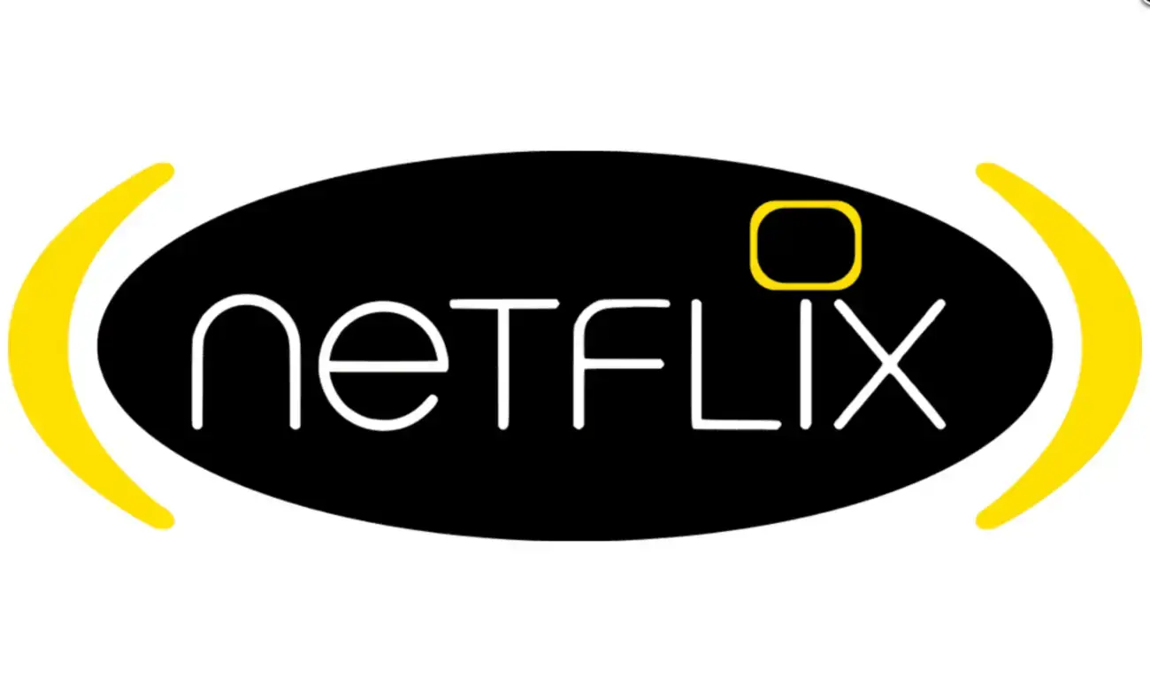
There was also a brief period in the early noughties when the website had a black-and-yellow design with TV as the dot above the ‘I’.
However, the brand made movie magic in 2014 when it introduced the red logo which has remained unchanged ever since.
The brand also introduced its ‘N’ emblem shortly after this, which is now used on the app’s icon.
We wonder what the logo will look like in another two decades' time.
Topics: Netflix, Technology, Twitter