
Realisation about Vans logo has left people mindblown
There's certain brands out there that we all know the logo for, like the Nike tick or the Adidas stripes.
And most of us know what the Vans logo looks like by now, right?
I mean they’ve been around for long enough.
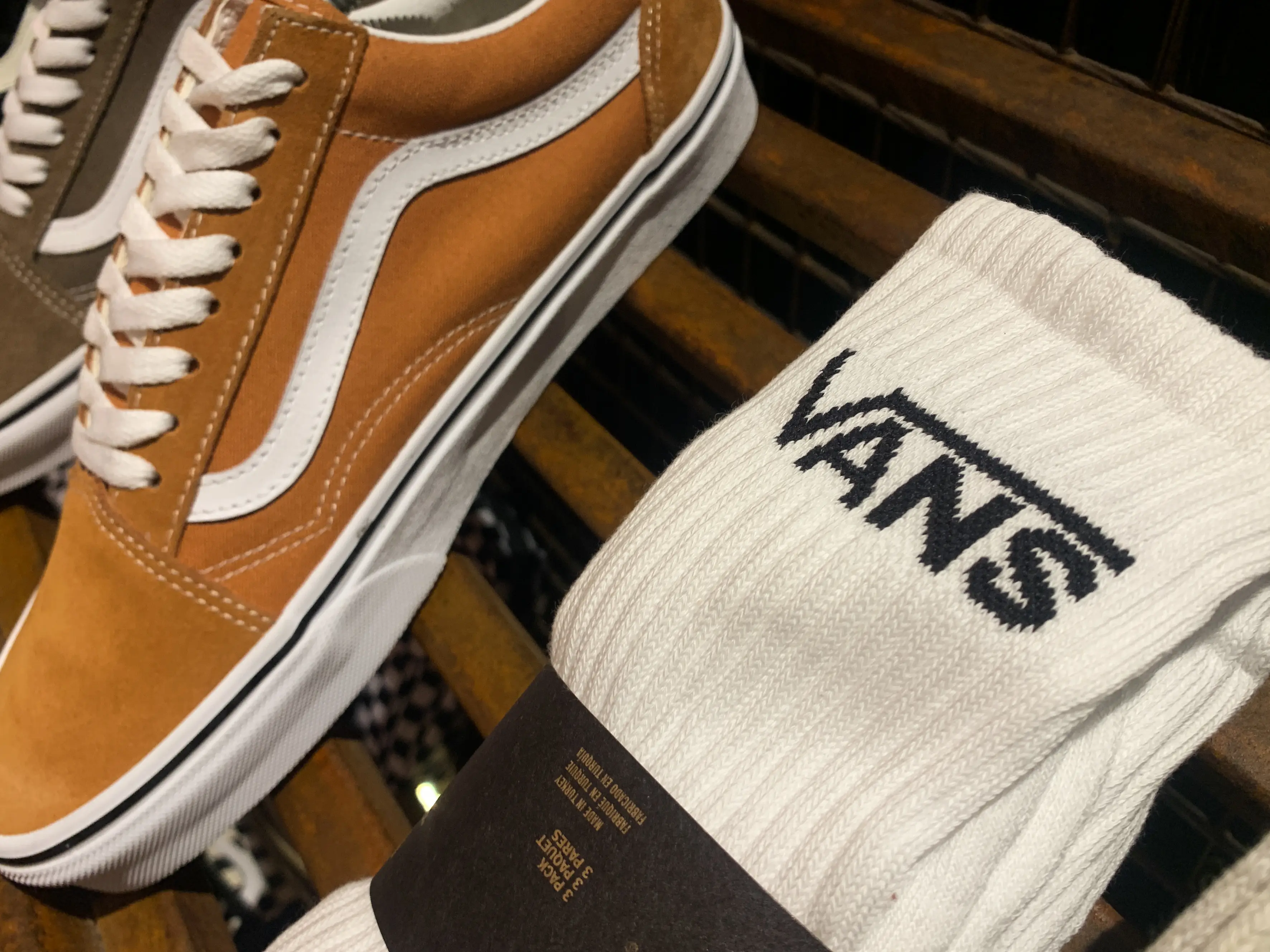
It's not exactly a difficult one to spot, it’s literally just ‘VANS’ but the V has a long line going along the top of the other letters, typically seen on the back of the shoe.
Advert
But the logo actually has a weird link with maths and once you’ve seen it, you won’t be able to un-see it.
Probably.
This weird realisation about the logo took hundreds of internet users by surprise, turning the familiar shoe brand into something much more complicated.
I mean, why are there so many letters involved in maths? Can’t we just keep things simple?
Rather than just four simple letters synonymous with big cars, TikTok users have realised that the 'V' in the logo is reminiscent of the 'square root' symbol, otherwise known, quite fittingly for a skater-associated brand, as a 'Radical'.
With the help of a calculator, internet users have shown that the logo for the shoe brand is the same as the equation for 'the square root of answer'. On a calculator, this appears as '√ANS'.
Responding to the realisation online, one astounded Twitter user wrote: "Once you see it, you can't unsee it."
Another mind-blown person commented: "Noooooooooooooo."
A third has gone as far as to create a whole scenario involving Vans and the maths equation, writing on Reddit: "So this is the scenario I thought up when I realized this.
"A guy walks into a Vans store. The guy at the counter asks him what his favourite type of shoe is, and he blatantly says "Vans!" The guy at the counter can then say 'Radical Answer, bro' and not sound stupid."
It's clear they've given it a lot of thought, but unfortunately the likeness to the equation doesn't appear to actually be intentional.
According to the Logo My Way blog, the familiar Vans logo stems back to the company's early days following its inception in 1966.
The original version of the logo was created by the son of the one of the brand's founders, who actually originally intended to paint it on a skateboard.
However, when his father James Van Doren saw the graphic, he decided to put it on the heel of one of the company's shoe designs.
That marked the start of Vans' large scale manufacturing of skateboarding footwear; a decision which has proved successful to this day.
With the long line stretching out over the final three letters, the Vans logo has become key to the company's visual brand identity, allowing customers to easily identify the shoes.
If I'm honest, I'm glad the logo doesn't seem to be intentionally rooted in maths. I don't want my footwear to feel like I’m back in school.