Amazon's logo is one of the most recognised in the world, and yet some people are only just finding out about its hidden meaning.
When the online shopping giant first started out all the way back in 1994, founder Jeff Bezos planned on creating the world's biggest bookstore.
As such, he wanted a fitting name and logo.
Tech editor Brad Stone wrote in his best-selling book The Everything Store that the CEO initially landed on the name Cadabra, as in abracadabra, but this was decided against as it was confused with the word Cadaver.
Advert

After looking at a number of different possibilities, Bezos then turned to the A section of the dictionary and came across Amazon.
Stone explained in the book: "This is not only the largest river in the world, it’s many times larger than the next biggest river."
It was a perfect fit for his intentions with the company, as he was hoping to make the online book selling platform equivalent.
Since those early days, Amazon has become a global juggernaut, branching out into pretty much any category you can think of.
And it's for this reason that the simple logo design it actually pretty damn genius.
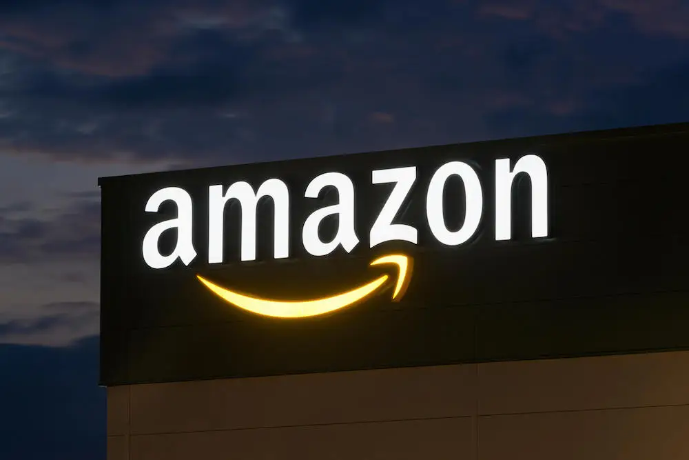
You see, while most people assume the orange arrow under the name represents a smile, it's actually pointing from 'a' to 'z', highlighting that Amazon sells everything you could need.
Plenty of people are only just discovering the meaning, with one writing on Twitter: "I just realised the arrow under the amazon logo indicates a to z I feel f**king stupid."
Another said: "I was today years old when I realized the arrow in the Amazon logo points from A to Z."
A third added: "Tell me why i just realized why the amazon logo has an arrow pointing from a to z… cos they deliver from point a to z oh my goshhhh."
What makes it even smarter is that it works for books just as it does for all categories. And it's not the only company to incorporate a clever hidden design in their logos.
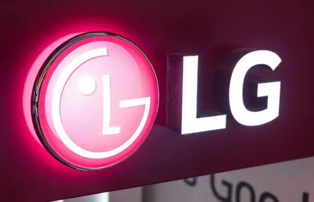
LG, for example – though it may just look like a winking face, look a little closer and you'll realise the nose is an L while the face is a G.

Same goes for Pinterest, which is both a P and also a drawing of a pin to match the name.
And let's not get started on Travelodge – for years we thought the design was a set of rolling hills, only to discover it's actually a person sleeping.
Topics: Amazon, Jeff Bezos